Datasheet
Year, pagecount:2014, 10 page(s)
Language:English
Downloads:22
Uploaded:August 16, 2017
Size:1 MB
Institution:
-
Comments:
Attachment:-
Download in PDF:Please log in!
Comments
No comments yet. You can be the first!Most popular documents in this category


Content extract
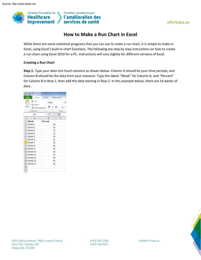
Source: http://www.doksinet How to Make a Run Chart in Excel While there are some statistical programs that you can use to make a run chart, it is simple to make in Excel, using Excel’s built-in chart functions. The following are step by step instructions on how to create a run chart using Excel 2010 for a PC. Instructions will vary slightly for different versions of Excel Creating a Run Chart Step 1. Type your data into Excel columns as shown below Column A should be your time periods, and Column B should be the data from your measure. Type the labels “Week” for Column A, and “Percent” for Column B in Row 1, then add the data starting in Row 2. In this example below, there are 14 weeks of data. 1 Source: http://www.doksinet Step 2. Using your mouse, highlight all the data Step 3. From the top menu, select Insert >> Line >> Line With Markers 2 Source: http://www.doksinet Step 4. A basic run chart will be displayed: Formatting There are many different
formatting features you might want to use, and the exact instructions for formatting will vary according to which version of Excel you are using. Step 5. Double click on the chart, and then use the features in Excel to format your chart Here are some basic ideas of how to format the run chart: a. Remove the legend from the right hand side 3 Source: http://www.doksinet b. Remove gridlines c. Format the vertical axis so there is more ‘white space’ on the graph A good rule of thumb is to have about 1/3 of the chart with the data line, 1/3 white space above the data line, and 1/3 white space below the data line (but don’t go below zero on the vertical axis). 4 Source: http://www.doksinet d. Add a title to the chart and to the vertical axis Adding a Median Line In order to analyze the chart, you need to add in a median line. In most cases, the line will be the median of all the data points that are on the chart. (The median is the middle value, if the values were sorted from
smallest to largest). See Step 15 if you want to create a median using baseline data Step 6. Calculate the median value of all the data points Click on a blank cell in the spreadsheet (see cell A19 below). Use the formula box to type in the formula In the example below, the values are from B2 to B15. The formula is =median(B2:B15) You will then see the result appear in the cell A19. The median of the data points for this chart is 225 5 Source: http://www.doksinet Step 7. The median line will be equal to 225, all across the chart In order to put this line on the chart, first type in the median value (22.5) in column C, as shown below Step 8. Add this median line to the run chart With your mouse, right-click on the chart A menu will come up. Choose Select Data 6 Source: http://www.doksinet Step 9. Then choose Add from the menu Step 10. Another menu will come up which is where you specify what data to add With your mouse, select the small box, shown by the arrow below. 7
Source: http://www.doksinet Step 11. When the Edit Series menu comes up, use your mouse to highlight the data from column C (don’t highlight the word ‘Median’). This step is shown below – see the dotted lines around cells C2 to C15. Then press enter Step 12. Press OK The new line (a straight line with the median value) will be on the chart 8 Source: http://www.doksinet Step 13. The median line should be a flat line with no squares (Excel calls these squares ‘markers’) Use the formatting functions to take remove the markers. The commands will be different depending on your version of Excel, but if you double click exactly on the median line, you should get a menu that allows you to take off the markers. Step 14. The median line should now be flat, as shown below The run chart can now be analyzed using the rules described by Perla, Provost, and Murray (2011)1. 1 Perla R, Provost L, Murray S (2011). The run chart: a simple analytical tool for learning from variation
in healthcare processes, BMJ Quality and Safety, 20, 46-51. 9 Source: http://www.doksinet Using Baseline Data for a Median Step 15. If you have baseline data (data that you collected before you made any changes), you usually want to use this baseline data for your analysis. In that case, you calculate the median line, using the baseline data points only. In the example below, new processes were introduced in week 6. Therefore, the median is calculated only from Weeks 1-5 (cells B2 to B6). Step 16. The baseline median using Weeks 1-5 = 17 Follow the previous steps to add the median line (this time with the value of 17). Add a text box to explain the median value Other options for the median line: a) If you do not have baseline data, but you are making gradual changes over time, it is good practice to use the first ten data points. b) If you are not introducing changes regularly and have no clear rationale for baseline data, use all the data points to calculate the median (as in
Steps 6-14). 10
 Just like you draw up a plan when you’re going to war, building a house, or even going on vacation, you need to draw up a plan for your business. This tutorial will help you to clearly see where you are and make it possible to understand where you’re going.