Comments
No comments yet. You can be the first!


Content extract
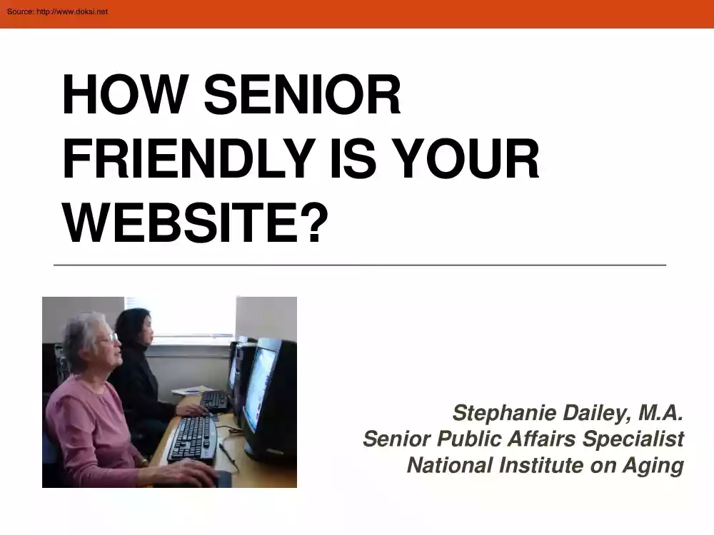
Source: http://www.doksinet HOW SENIOR FRIENDLY IS YOUR WEBSITE? Stephanie Dailey, M.A Senior Public Affairs Specialist National Institute on Aging Source: http://www.doksinet Today’s Presentation 1. Why should websites be senior friendly? 2. Research basis for senior-friendly web design. 3. What are senior-friendly web design features? 4. How do you know if your website is senior friendly? 5. Where are websites falling short? 6. What are best practices when it comes to senior-friendly web design? 7. What resources are available to help create senior-friendly websites? Source: http://www.doksinet Why should websites be senior friendly? Today, more than 53% of people 65 and older are online. Growth has been steady over the years Source: Pew Internet and American Life Project Source: http://www.doksinet The numbers of older people online have been growing steadily. • 1998 -- 9% of people 55+ had home access • 2000 -- 15% of people 65+ were online • 2004
-- 22% of people 65+ were online • 2009 -- Nearly 40% of people 60+ were online • 2012 -- 53% of people 65+ are online and 34% use social networking sites Source: Pew Internet and American Life Project Source: http://www.doksinet What Research Has Shown • Research funded by the National Institute on Aging (NIA) has shown that cognitive and vision changes among older adults can affect how well they perform in an online environment. Source: http://www.doksinet If websites are senior-friendly • they can better serve the growing numbers of older adults who visit them. • they are easier to use, and a good place to start, for older people who are new to the Internet. • they are easier for other age groups to use as well. Source: http://www.doksinet Senior-friendly web design is based on • vision research • cognitive aging research Source: http://www.doksinet What is a senior-friendly website? A website with information that older people can easily •
See • Comprehend • Navigate Source: http://www.doksinet NIHSeniorHealth.gov A website built with older adults in mind Source: http://www.doksinet NIHSeniorHealth.gov -- Basic Facts Jointly developed by the National Institute on Aging (NIA) and the National Library of Medicine (NLM) at NIH. Launched in 2003. Design was updated in 2012 Web design grew out of NIA’s research on the cognitive and vision changes that are part of the normal aging process. Numerous focus groups were held with adults age 60 – 88. The site features 60 health and wellness topics geared toward adults 60+. Topics are added and updated regularly Topics contain background information, videos, quizzes, images and FAQs. Topics are contributed by NIH institutes and centers and other Federal agencies. Source: http://www.doksinet How to Make a Website Visually Comfortable for Older Adults Source: http://www.doksinet Vision research has shown that with age, these vision
functions may decline and can affect how an older adult performs on a website. • Reductions in the amount of light that reaches the retina • Loss of contrast sensitivity • Loss of the ability to detect fine details Source: http://www.doksinet Type is 12 point, sans serif. Uncondensed. Text is left justified. No italics. Headings are distinguished by size, weight, and color. Adequate space between paragraphs and lines within paragraphs. gg Ample white space. Source: http://www.doksinet Use Vivid colors for typeface Vivid color Faint color Vivid color Faint color Vivid color Faint color Vivid color Faint color Source: http://www.doksinet Resize text button. Source: http://www.doksinet Resize text button. Source: http://www.doksinet High contrast color scheme. Source: http://www.doksinet Change contrast button. Source: http://www.doksinet Are Your Web Pages Visually Comfortable for Older Adults? • Take Online Poll: Which of the following features are
characteristic of your website? (check all that apply) Main typeface is 12-14 pt. sans serif A “text resize” button is available. Typeface color contrasts sharply with background color. Main site colors contrast with each other. There are generous amounts of white space. Source: http://www.doksinet Where Websites Fall Short – Vision Issues Source: http://www.doksinet Factors that Make Web Pages More Difficult to See -Typeface: • Typeface is too small. • Typeface is condensed. • Italics are used too much or are featured in prominent places. • If present, the “Resize Text” button is often inconspicuous and usually not on every page. Justification: • Text is not left justified. Source: http://www.doksinet Factors that Make Web Pages More Difficult to See -Backgrounds/Contrast: • Main colors are not high contrast. • Pastels are used. Shades of the same color are layered against one another • Typeface is too faint, lacking sufficient
color to create a good contrast with the background color. • Headings are not distinguished by size, weight, or color. Spacing: • Not enough white space, creating a crowded look. • Not enough space between paragraphs or between lines within paragraphs. Source: http://www.doksinet Addressing Older Adults’ Cognitive Needs Source: http://www.doksinet Cognitive aging research has shown that these cognitive functions are involved in using a website. With age, these functions may decline, affecting how an older adult performs on a website. • working memory • spatial working memory • perceptual speed • text comprehension • attentional function Source: http://www.doksinet Definitions of Cognitive Functions • Working memory -- the ability to simultaneously grasp, retain, and manage new information. • Spatial working memory -- the ability to remember where things are located and actually find them. • Perceptual speed
-- the speed at which a person processes information. • Text Comprehension -- the ability to understand written text. • Attentional Function -- the ability to stay focused on specific information and eliminate distractions Source: http://www.doksinet How to Make Web Content Easy for Older Adults to Comprehend Source: http://www.doksinet Content is written in straightforward, concrete language. Key information is first, followed by specifics. Steps are numbered. Content is organized into short sections, or “chunks”, making it easier to grasp and helping with recall. Source: http://www.doksinet Headings and subheadings divide content into smaller segments. Bulleting divides content into segments. White space is used to segment information. Bolding highlights discrete bits of information, separates the general from the specific, and introduces new content. Source: http://www.doksinet White space helps drive users’ attention to content, reducing distraction.
Paragraphs and sentences are short. Language is free of jargon. Active voice. Images are textrelevant. Source: http://www.doksinet Quizzes reinforce information, helping with recall. Source: http://www.doksinet Are Your Web Pages Easy for Older Adults to Comprehend? • Take Online Poll : Which of the following features are characteristic of your website? (check all that apply) Simple and straightforward language is used. Content is frequently broken up into shorter segments. Images are almost always text relevant. Frequent use of headings and subheadings. Frequent use of bulleting and bolding to highlight and separate material. Source: http://www.doksinet Where Websites Fall Short Text Comprehension Issues Source: http://www.doksinet Factors That Can Impede Comprehension of Content • Key information is not placed first and content does not flow from the general to the specific. • Content is not broken up into small enough segments, making it hard
to grasp and retain the information. • There is insufficient use of headers and titles to segment and introduce content. • Bulleting, bolding and numbering are not used often enough to highlight, segment, or order content. • Too much content is crowded onto a page and is not visually differentiated enough. Source: http://www.doksinet Factors That Can Impede Comprehension of Content • Sentences are not written in a simple, straightforward style. • Sentences and paragraphs are too long. • Jargon, passive voice are used. • Too many of the images used are not directly relevant to surrounding content. Source: http://www.doksinet How to Make A Website Easy for Older Adults to Navigate Source: http://www.doksinet Clear indication starting on the home page of how content is organized on the site. Information is organized into a few broad categories, making it easy to focus attention and find a place to start. Home page has no automatically moving graphics, reducing
distraction. Source: http://www.doksinet Navigational framework is maintained throughout the site. Navigational structure signaled on home page is carried through and further delineated on subsequent pages. Source: http://www.doksinet Consistent location and relevance of navigation buttons. Consistent placement and relevance of chapter links. Source: http://www.doksinet Links are clearly labeled. They predict what will appear when clicked. Links are sufficiently large and provide enough space around them for easy clicking. Links stand out against background, making them easy to find and get to. Links open on single click. They change color when moused over. Source: http://www.doksinet Avoid horizontal scrolling and automatic scrolling text. Minimal use of vertical scrolling. Source: http://www.doksinet Prompts help guide users as they navigate. Source: http://www.doksinet Prompts use action verbs to help guide users as they navigate. Prompts use action verbs to
help guide users as they navigate. Source: http://www.doksinet Prompts use action verbs to help guide users as they navigate. Source: http://www.doksinet Links are sufficiently large and provide enough space around them for easy clicking. Source: http://www.doksinet Navigation elements introduced within the site remain consistent. Source: http://www.doksinet Navigation elements introduced within the site remain consistent. Source: http://www.doksinet Drop down list remains stable, allowing users to easily click on links. Links are highlighted when moused over. Alt –tag appears with sufficient description about what users will find once they click on the link. Source: http://www.doksinet Are Your Web Pages Easy for Older Adults to Navigate? • Take Online Poll: Which of the following features are characteristic of your website? (check all that apply) Organization of content is clear and remains consistent throughout. Navigation elements are located in the
same place on most pages. Links are clearly labeled, indicating what users will find when they click. Links have sufficient space around them for easy clicking. Prompts use action verbs to direct users to take specific steps. Source: http://www.doksinet Factors That Can Make Navigation Difficult (and Make It Harder to Find Information) • Content organization. Information is spread out over too many categories, with unclear hierarchy, making it difficult to know where to start and how to choose pathways into the site. • Shifting navigational structure. New navigational elements continually appear and shift location when pages change. Users find they must continually reorient themselves to the website. • Crowded pages. Pages have too much information Layouts lack sufficient white space, making it difficult to focus and find specific content. • Links are not easy to use. Links are not obvious They are not clearly labeled and are too small. There may not be
sufficient space around them for easy clicking • Automatically moving Images. Images and graphics change automatically and quickly, leading to distraction. • Drop-down Lists. Lists are unstable when moused over Users are required to slide the mouse over the list and click the link in one motion. Source: http://www.doksinet What are best practices for seniorfriendly web design? • Making the Website Easy to See • Making Content Easy To Understand • Making the Website Easy to Navigate Source: http://www.doksinet Best Practices Making the Website Easy to See 12 – 14 point sans serif typeface, uncondensed. A text resize button, easily visible throughout the site. A high contrast color scheme throughout the site, where background colors contrast with typeface and foreground colors. Titles and headings are distinguished by color, weight, and size. Left-justified text. Adequate spacing between paragraphs and between lines within paragraphs.
Generous amounts of white space. Little or no use of italics or layered pastels. Source: http://www.doksinet Best Practices -Making Content Easy To Understand Key information presented first. Content should flow from the general to the specific. Content is broken into short segments. Use of clear headers and titles to introduce and segment information. Use of bulleting, bolding, and numbering to highlight, segment, and order content. Use of simple, straightforward language. Short sentences and paragraphs Use of active voice. Strategic use of white space as a way to help users focus on content. Use of mainly text-relevant images. Source: http://www.doksinet Best Practices Making the Website Easy to Navigate Content is organized by broad categories and proceeds from the general to specific. The organization of the content is clear and remains consistent throughout the site. There is consistent placement of navigational elements
throughout the site. The amount of content on a page is kept within reasonable limits. Source: http://www.doksinet Best Practices Making the Website Easy to Navigate Links are clearly labeled and sufficiently large, and they contrast with the background color. There is sufficient space around links. Prompts use action verbs to direct users as they navigate. There are few if any automatically moving images, graphics, or pop-ups. Vertical scrolling is minimized. Avoid automatic scrolling text or horizontal scrolling. Drop down lists should not make users slide the mouse and click all in one movement. Source: http://www.doksinet “Making Your Web Site Senior Friendly” is available at the National Institute on Aging’s website at www.nianihgov Source: http://www.doksinet Get Free “Healthy Aging Tips” from NIHSeniorHealth.gov Source: http://www.doksinet Examples of “Healthy Aging Tips” • Trouble sleeping? See these tips for a good
night’s sleep. • If you’re healthy now, why exercise? See the benefits here. • What foods contribute to healthy aging? Check out these tips. • Is stroke preventable? Find out here. • Concerned about falling? See 5 ways to reduce your risk. • Want to limit added sugars in your diet? See these tips. • What are ways to avoid medication side effects? Get tips here. • How can you lower your risk for cataract? Find out here. Source: http://www.doksinet Free Bookmarks at www. nianihgov Source: http://www.doksinet Free Materials from Go4Life Source: http://www.doksinet Free Materials from Go4Life Source: http://www.doksinet www.nihseniorhealthgov Source: http://www.doksinet References Chisnell, D., and Redish, JC Designing web sites for older adults: Expert review of usability for older adults at 50 web sites. AARP February 2005. Available at http://www.aarporgolderwiserwired/owwresources/designing web sites for older adults expert review .html Coyne, K.P, and
Nielsen, J Web Usability for Senior Citizens Nielsen Norman Group. April 2002 Available at http://www.nngroupcom/reports/seniors Craik, F.IM, and Salthouse, TA The Handbook of Aging and Cognition. Mahwah, NJ: Lawrence Erlbaum Associates, 2000 Source: http://www.doksinet References Echt, K.V Designing web-based health information for older adults: Visual considerations and design directives. In R.W Morrell, ed Older Adults, Health Information and the World Wide Web, 61-88. Mahwah, NJ: Lawrence Erlbaum Associates, 2002. Fox, S. Older Americans and the Internet Pew Internet and American Life Project. March 2004 Available at http://www.pewinternetorg/PPF/r/117/report displayasp Fox, S. Generations Online Data Memo Pew Internet and American Life Project. January 2009. Available at http://www.pewinternetorg/~/media//Files/Reports/2009/PIP Generations Source: http://www.doksinet References Morrell, R. W, Dailey, S R, & Rousseau, G K (2003) Commentary: Applying Research: the NIH
Senior Health Project. In N Charness & K W Schaie, (eds), Impact of Technology on Successful Aging (pp. 134 - 161) New York: Springer Publishing. Morrell, R.W The application of cognitive theory in aging research. Cognitive Technology, 2 (1997): 44-47 Park, D.C (1992) Applied cognitive aging research In FIM Craik & T.A Salthouse, (Eds) Handbook of Cognition and Aging (pp 449-493). Mahwah, NJ: Lawrence Erlbaum Associates